Chess Training Wheels
Chess Training Wheels is a working chess game with visualizations of relative power relationships. It is designed to help novice to intermediate chess players see opportunities and risks when making moves.
Download
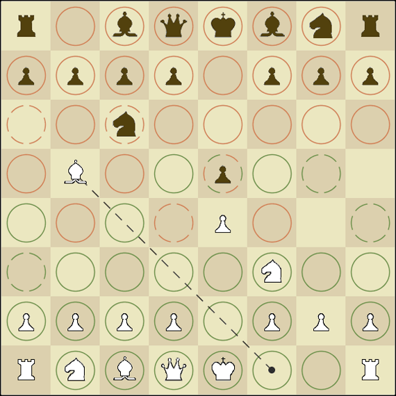
Chess Training Wheels is written in Java and is open source. It is provided as a JAR file that can be run on Macs OS X as well as PCs with Java installed. Source code is included in the download.
Download Chess Training Wheels 0.5 (ZIP, 0.8 MB)
Visualizations
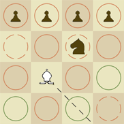
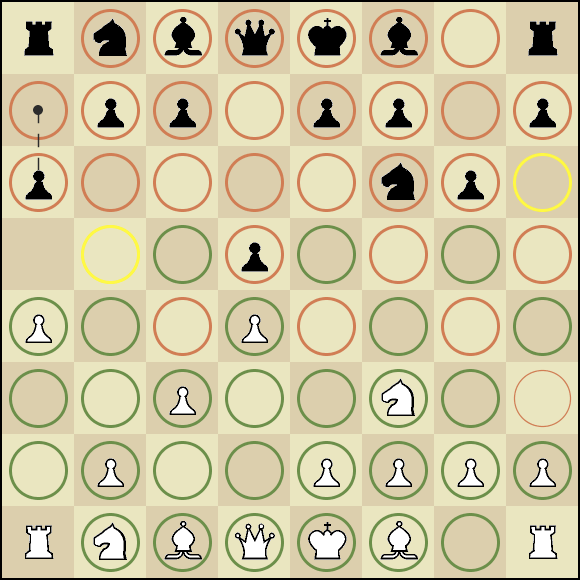
Relative Threats
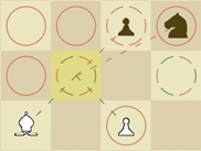
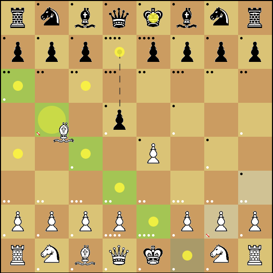
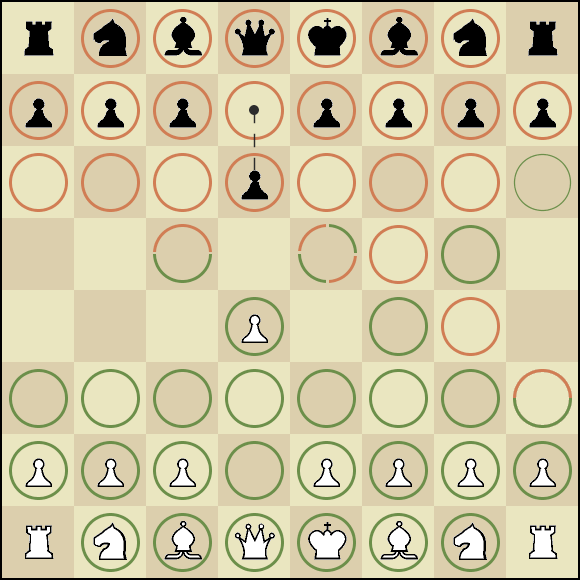
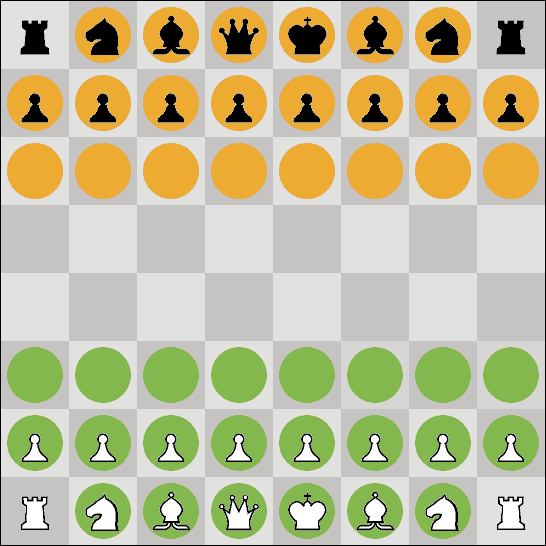
Chess Training Wheels uses circles to indicate the ability of each side to attack the squares on the board. Green circles indicate that white can attack that square. Red circles indicate that black can attack that square. Broken circles indicate that both sides can attack a square. The coloring of a broken circle indicates which side has an advantage as detailed in the image to the right.
Advantages are determined by who would come out ahead if both sides traded pieces. For example, if white can attack a square with a pawn and black can attack it with a bishop then white has the advantage. Trading a pawn for a bishop is generally a good move. Only the weakest piece that can attack a square is considered. Also, the system does not currently take into account the piece on the square (as of version 0.5). This is an oversight that will be fixed in future versions.
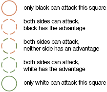
At the beginning of the game, the board looks like this.
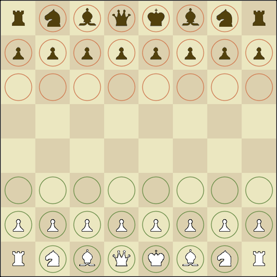
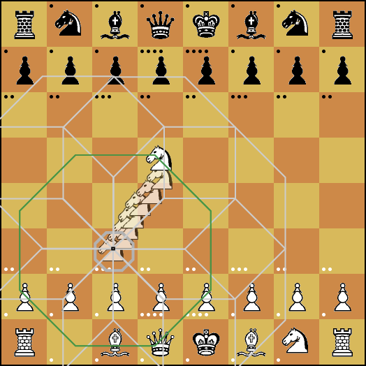
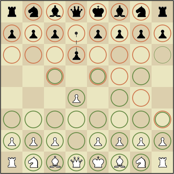
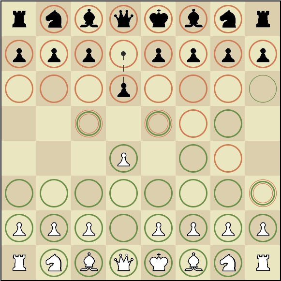
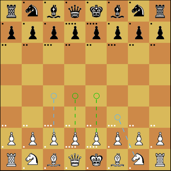
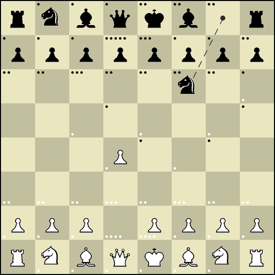
Below is an example of how the board might look after a few moves.
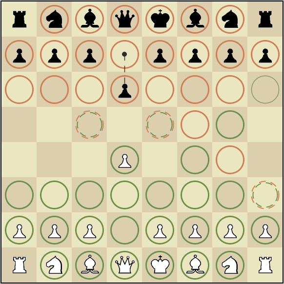
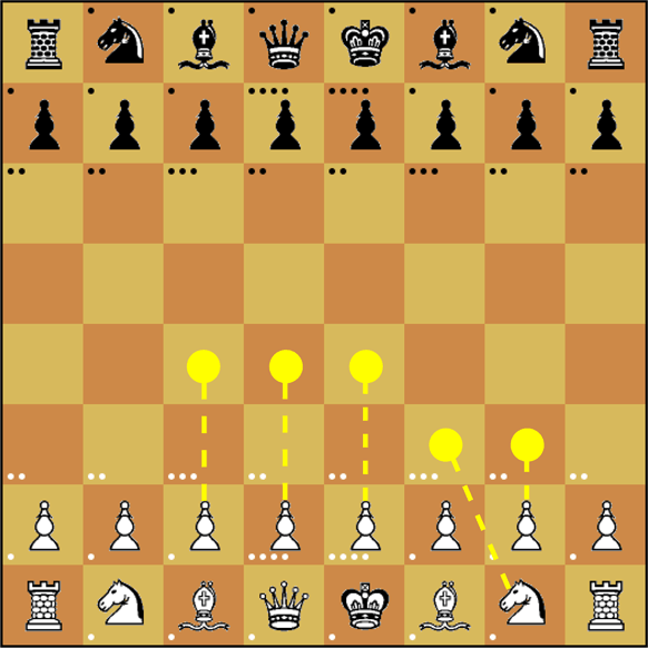
Attack Lines
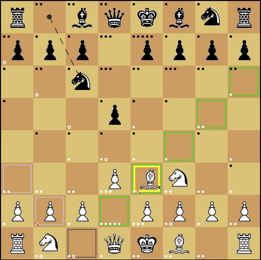
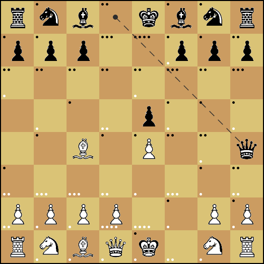
When you click on a square, dotted lines indicate which pieces can attack that square. Green lines indicate an attack from a white piece. Red lines indicate an attack from a black piece. To the right is an example.
Movement Lines
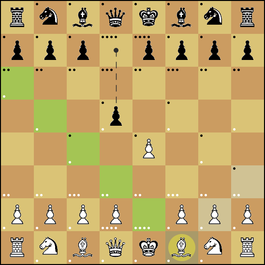
A black dotted line is used to indicate the last piece that moved. This can be a helpful reminder. It is also a useful indicator that it is your turn if you happen to be looking away while the computer makes its move.
Process
History
The idea for Chess Training Wheels came in 2001 when I realized that I was not nearly as good at chess as I thought that I should be. Unfortunately, the idea sat on the backburner until the Fall of 2007 when I got a chance to develop the first version for my Software Architecture for User Interfaces class at Carnegie Mellon (thank you Scott Hudson). This early version was rough, but allowed my to get the major technical issues out of the way and start developing the visualizations. Then in the Spring of 2008, I developed and refined the visual language for my Mapping and Diagramming class (thank you Karen Moyer and the rest of the class). As of this writing, I still have a "to do" list and plan to keep developing these ideas as time permits.
Initial Idea
The initial inspiration came from the experience of playing Tetris too much and seeing patterns of blocks when I closed my eyes. Maybe if a game showed the chess pieces as shapes representing patterns of movement, I could learn to see these same patterns when playing chess in real life.
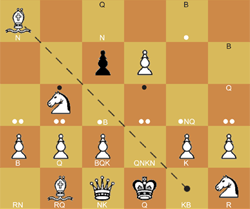
Unfortunately, this idea turned out to be tricky to pull off. Patterns of movement for the chess pieces overlap so much that it quickly becomes visual noise. Even just visualizing the possible movements of a single piece for the next two turns is unintelligible, as seen in the "sketch" to the left.
The idea of visualizing movement patterns remained, but it was primarily used to show possible and blocked moves for a selected piece. First by drawing color coded boxes inside the squares. Then by changing the color of the squares themselves. Later, I experimented with drawing circles on the squares instead. This approach fit well with the rings that were later developed to show relative threats. I also added yellow dots to indicate the pattern of possible movement for a selected piece on the following turn.
Attack Counts
While this simplified visualization of movement patterns was intelligible, it was not particularly helpful for gaining new insights. Another idea was needed. I tried to visualize power relationships by drawing a dot on each square for each white piece and each black piece that could attack that square. This approach was more helpful. It revealed which squares where defended and which were vulnerable. It also highlighted squares that were highly contested and indicated which side had more influence over a square (i.e. could attack the square with more pieces).
This idea was further developed by updating the dots as a selected piece was being dragged across the board. Red lines were used to "cross out" attacks that would be lost. Empty circles were used to indicate attacks that would be gained. Thus you could get a preview of how a given move would effect the board.
However, this approach had issues as well. It provided so much information that nothing really stood out at a glance. You could inspect a given square to see if it was defended or not, but opportunities did not jump out at you immediately. And the dynamic updates to the dots were not always easy to see. The design was not glanceable. And despite the visual overload, information was missing. Attacks from each piece appeared as a dot, whether the piece was a pawn, a queen or even a king. However, trading a queen for a pawn would be disastrous (for the queen's owner anyways).
I searched for other approaches. I tried replacing the dots with characters to indicate which piece(s) could attack a square, as seen above. This just increased the information overload. I realized that a radical simplification was needed.
Relative Threats
The next approach was to simplify the information for each square. I thought through what was needed and decided on 5 "messages" for each square:
- black controls the square
- black has an advantage
- there is an equal threat from both sides
- white has the advantage
- white controls the square
Of course, there is also an implicit sixth state when there is no message: neither side can attack a square.
Finding the right visual language to communicate this information was tricky. A number of colors and shapes were tried out, as seen below, before the final visual language was arrived at.
Opening Moves
Some ideas were abandoned in order to focus on the most important visualizations. One of these ideas was to provide help with opening moves. After reading some chess books, I discovered that there is a set of standard opening moves that could be programmed into the system to help the player get through the first 2 to 3 moves. However, this idea was different enough from the other ideas being worked on that it was never developed past the sketches below.
Other Changes
Along the way, many small changes were made to the pieces and the board itself. The pieces were visually simplified to prevent them from competing with the visualizations. The squares were enlarged somewhat to provide more visual breathing room. A number of different colors were explored for the squares themselves. Different colors for the pieces were also experimented with.
Research and the Design Process
This project used what Dan Saffer somewhat ironically calls "Genius Design" in his Designing for Interaction book. Which is to say that it did not involve user research. I was the primary user and test subject for the project. My classmates and teacher for Mapping and Diagramming were secondary users, but provided feedback in the form of class critique rather than user testing or interviews. This is essentially the approach that Apple uses to design its products.
While it would be interesting to perform user research on this project, getting useful user data is not quite straight forward. This project is not about allowing a user to perform a given task. It is about giving a player new insights. Insights that may not be fully conscious. It is hard to probe into the level and nature of a user's insightfulness during a testing session. While you could test users both with and without visualizations to see how they performed, this would at best indicate whether the visualizations were helpful. It is much harder to discover why a visualization was or was not effective or suggest what type of visualization might be missing. The ultimate success for this project would be helping people (including myself) to think about chess better when they do not have the visualizations. This is even harder to test.
Acknowledgements
Chess Training Wheels uses code from the following sources:
Chessbox by Xan Gregg (a Java port of GNU Chess, used as the computer opponent)
xChess by MD. Z. Hossain (modified source code used for connecting to GNU Chess)
Killer Game Programming in Java by Dr. Andrew Davison, which provided a starting point for the screen refresh code
Thanks to the original authors. Thanks to Karen Moyer, Scott Hudson and my classmates in Mapping and Diagramming for your help and guidance as well as the chance to develop this project.